【JQuery】ふわっと切り替わるタブ切り替えをサクッと実装!
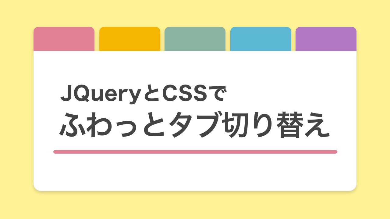
クリックでふわっと切り替わる「タブ切り替え」をJQueryとCSSでシンプルに作るやり方です。コピペでどうぞ。

タブ切り替えのサンプル
タブ01
タブ02
タブ03
タブ04
タブ05
●タブ01のコンテンツです
●タブ01のコンテンツです
●タブ01のコンテンツです
●タブ01のコンテンツです
●タブ01のコンテンツです
●タブ02のコンテンツです
●タブ02のコンテンツです
●タブ02のコンテンツです
●タブ02のコンテンツです
●タブ02のコンテンツです
●タブ03のコンテンツです
●タブ03のコンテンツです
●タブ03のコンテンツです
●タブ03のコンテンツです
●タブ03のコンテンツです
●タブ04のコンテンツです
●タブ04のコンテンツです
●タブ04のコンテンツです
●タブ04のコンテンツです
●タブ04のコンテンツです
●タブ05のコンテンツです
●タブ05のコンテンツです
●タブ05のコンテンツです
●タブ05のコンテンツです
●タブ05のコンテンツです
コードはこちら
<!-- JQuery本体の読み込み(既に読み込んでいる場合は不要) -->
<script src="https://ajax.googleapis.com/ajax/libs/jquery/3.6.0/jquery.min.js"></script>
<div class="tab-wrap">
<div class="tab-list">
<div class="tab-item is-active">タブ01</div>
<div class="tab-item">タブ02</div>
<div class="tab-item">タブ03</div>
<div class="tab-item">タブ04</div>
<div class="tab-item">タブ05</div>
</div>
<div class="panel-list">
<div class="panel-item is-active">コンテンツ01</div>
<div class="panel-item">コンテンツ02</div>
<div class="panel-item">コンテンツ03</div>
<div class="panel-item">コンテンツ04</div>
<div class="panel-item">コンテンツ05</div>
</div>
</div>$('.tab-item').on('click', function() {
var tabIndex = $('.tab-item').index(this);
$('.tab-item, .panel-item').removeClass('is-active');
$('.panel-item').eq(tabIndex).addClass('is-active');
$(this).addClass('is-active');
});/* タブ */
.tab-list {
display: flex;
justify-content: space-between;
}
.tab-item {
width: 19%;
padding: 10px 0;
border-radius: 6px 6px 0 0;
background-color: #e28194;
color: #999;
text-align: center;
cursor: pointer;
transition: .4s ease-in-out;
}
.tab-item:first-child {
background-color: rgba(226, 129, 148, 0.15);
}
.tab-item:nth-child(2) {
background-color: rgba(245, 182, 2, 0.15);
}
.tab-item:nth-child(3) {
background-color: rgba(138, 179, 161, 0.15);
}
.tab-item:nth-child(4) {
background-color: rgba(92, 183, 212, 0.15);
}
.tab-item:last-child {
background-color: rgba(177, 121, 196, 0.15);
}
/* タブをクリックした時 ホバーした時 */
.tab-item:hover, .tab-item.is-active {
color: #333;
}
.tab-item:first-child:hover, .tab-item:first-child.is-active {
background-color: #e28194;
}
.tab-item:nth-child(2):hover, .tab-item:nth-child(2).is-active {
background-color: #f5b602;
}
.tab-item:nth-child(3):hover, .tab-item:nth-child(3).is-active {
background-color: #8ab3a1;
}
.tab-item:nth-child(4):hover, .tab-item:nth-child(4).is-active {
background-color: #5cb7d4;
}
.tab-item:last-child:hover, .tab-item:last-child.is-active {
background-color: #b179c4;
}
/* パネル */
.panel-list {
background-color: #fff;
}
.panel-item {
display: none;
width: 100%;
padding: 40px 30px;
background-color: #fff;
}
.panel-item.is-active {
display: block;
animation: panel-show .9s ease-in-out forwards;
}
/* パネル切り替えのアニメーション */
@keyframes panel-show {
from {
opacity: 0;
}
to {
opacity: 1;
}
}まとめ
今クリックされているタブがどれなのかを見た目で分かりやすくするのもポイントです。今回のサンプルでは通常時のタブの色は透過させた淡い色にして、アクティブ時に元の濃い色に戻しています。