【CSS】上だけ角丸などborder-radiusを使った角丸サンプル集

■2026年1月:加筆修正を行いました。
CSSのborder-radiusを使うと、要素の角の半径を指定して角丸を作ることができます。今回は4つの角を同じ丸さにするのではなく一部の角だけ角丸にしたい場合のやり方です。
特に「上だけ角丸」(左上と右上の角だけ丸くする)はタブ切り替えのタブの形としてよく使うので、書き方を覚えておくと便利です。
目次 
角丸のサンプル
4つすべて角丸
4つすべて角丸
コードを見る
<p class="tab-all">4つすべて角丸</p>.tab-all {
/* 基本のスタイル */
width: 280px;
padding: 15px 0;
background-color: #21be78;
font-size: 14px;
color: #fff;
text-align: center;
/* 角丸のスタイル */
border-radius: 8px;
}上だけ角丸
上だけ角丸
コードを見る
<p class="tab-top">上だけ角丸</p>.tab-top {
/* 基本のスタイル */
width: 280px;
padding: 15px 0;
background-color: #21be78;
font-size: 14px;
color: #fff;
text-align: center;
/* 角丸のスタイル */
border-radius: 8px 8px 0 0;
}下だけ角丸
下だけ角丸
コードを見る
<p class="tab-bottom">下だけ角丸</p>.tab-bottom {
/* 基本のスタイル */
width: 280px;
padding: 15px 0;
background-color: #21be78;
font-size: 14px;
color: #fff;
text-align: center;
/* 角丸のスタイル */
border-radius: 0 0 8px 8px;
}右だけ角丸
右だけ角丸
コードを見る
<p class="tab-right">右だけ角丸</p>.tab-right {
/* 基本のスタイル */
width: 280px;
padding: 15px 0;
background-color: #21be78;
font-size: 14px;
color: #fff;
text-align: center;
/* 角丸のスタイル */
border-radius: 0 8px 8px 0;
}左だけ角丸
左だけ角丸
コードを見る
<p class="tab-left">左だけ角丸</p>.tab-left {
/* 基本のスタイル */
width: 280px;
padding: 15px 0;
background-color: #21be78;
font-size: 14px;
color: #fff;
text-align: center;
/* 角丸のスタイル */
border-radius: 8px 0 0 8px;
}1つだけ角丸(左上)
1つだけ角丸(左上)
コードを見る
<p class="tab-top-left">1つだけ角丸(左上)</p>.tab-top-left {
/* 基本のスタイル */
width: 280px;
padding: 15px 0;
background-color: #21be78;
font-size: 14px;
color: #fff;
text-align: center;
/* 角丸のスタイル */
border-radius: 8px 0 0 0;
/* 個別で指定する場合の書き方 */
border-top-left-radius : 8px;
}1つだけ角丸(右上)
1つだけ角丸(右上)
コードを見る
<p class="tab-top-right">1つだけ角丸(右上)</p>.tab-top-right {
/* 基本のスタイル */
width: 280px;
padding: 15px 0;
background-color: #21be78;
font-size: 14px;
color: #fff;
text-align: center;
/* 角丸のスタイル */
border-radius: 0 8px 0 0;
/* 個別で指定する場合の書き方 */
border-top-right-radius : 8px;
}1つだけ角丸(右下)
1つだけ角丸(右下)
コードを見る
<p class="tab-bottom-right">1つだけ角丸(右下)</p>.tab-bottom-right {
/* 基本のスタイル */
width: 280px;
padding: 15px 0;
background-color: #21be78;
font-size: 14px;
color: #fff;
text-align: center;
/* 角丸のスタイル */
border-radius: 0 0 8px 0;
/* 個別で指定する場合の書き方 */
border-bottom-right-radius : 8px;
}1つだけ角丸(左下)
1つだけ角丸(左下)
コードを見る
<p class="tab-bottom-left">1つだけ角丸(左下)</p>.tab-bottom-left {
/* 基本のスタイル */
width: 280px;
padding: 15px 0;
background-color: #21be78;
font-size: 14px;
color: #fff;
text-align: center;
/* 角丸のスタイル */
border-radius: 0 0 0 8px;
/* 個別で指定する場合の書き方 */
border-bottom-left-radius : 8px;
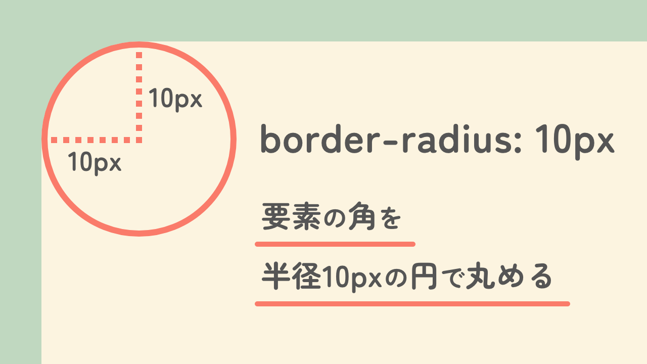
}まずborder-radiusとは
「radius」は「半径」という意味です。border-radiusは、下記の図のように要素の角をその半径の円で丸めるものです。
一部だけ角丸にする方法
左上から開始してコの字順
値を4つまとめて指定する書き方の場合、順番は左上から始まる「コの字」順です。つまり「左上 → 右上 → 右下 → 左下」。これだけ覚えておけば大丈夫です!
たとえば、下記のサンプルのように値が「8px 8px 0 0」と4つ並んでいる場合は「左上8px 右上8px 右下0px 左下0px」と指定していることになるので、上側2つの角だけが角丸になります。
.tab-top {
  /* 左上8px 右上8px 右下0 左下0  */
  border-radius: 8px 8px 0 0;
}
上だけ角丸
marginやpaddingの場合と混同しない
marginやpaddingで値を4つまとめて指定するときの書き方と混同しないようにしましょう。marginやpaddingの場合は「上→右→下→左」の順ですが、border-radiusは「角」に対するものなので「左上 → 右上 → 右下 → 左下」となっています。
値を2つだけ書いた場合はどうなる?
marginやpaddingの話が出ましたが「margin: 10px 20px」のように値を2つだけ指定する書き方がありますよね。marginやpaddingの場合は「上下」と「左右」をまとめて指定したいときに使います。
ではborder-radiusで値を2つだけ指定した場合はどうまとめられるのかというと「左上&右下 → 右上&左下」です。対角線上の角を同じ値にしたいときに使えます。
たとえば、下記のサンプルのように値が「50px 8px」と2つ並んでいる場合は「左上と右下50px 右上と左下8px」と指定していることになります。楕円の変形?のような見た目になるので、値を工夫することで見出しやカード型のデザインにも利用できそうです。
.tab-ellipse {
  /* 左上と右下が50px 右上と左下が8px*/
  border-radius: 50px 8px;
}
値を2つだけ指定した場合
4つバラバラな丸さにすることも可能
もちろん、4つ指定するやり方で全部違う値にすればすべての角をバラバラの丸さにすることも可能です。
.tab-free {
  /* 左上20px 右上8px 右下60px 左下40px  */
  border-radius: 20px 8px 60px 40px;
}
全部違う角丸
個別のプロパティで書く方法
1つの角だけを指定したい場合は、4つまとめて書く方法のほかに個別のプロパティを指定する方法もあります。
/* 1つだけ角丸(左上) */
border-top-left-radius : 8px;

/* 1つだけ角丸(右上) */
border-top-right-radius : 8px;

/* 1つだけ角丸(右下) */
border-bottom-right-radius : 8px;

/* 1つだけ角丸(左下) */
border-bottom-left-radius : 8px;
長いプロパティ名ですが、よく見ると「そのまま」です。「border」と「radius」の間に位置情報(top、leftなど)をハイフンでつなげているだけですね。
まとめ
border-radiusで一部だけ角丸にしたいときのやり方でした。「上だけ角丸」のタブを使った、JQueryのタブ切り替え記事についてはこちらをどうぞ。
