【CSS】くの字矢印・三角・丸囲み三角の矢印アイコンサンプル集
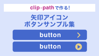
■2025年9月追記
矢印や三角をborderではなくclip-pathで作るサンプル集を新たに作りました。clip-pathのほうが今はおすすめですので良ければこちらをご覧ください↓
CSSだけで作るいろいろな矢印アイコン付きボタンをまとめました。くの字矢印、三角、丸囲み三角の3種類です。
目次 
いろいろな矢印アイコンのサンプル
くの字矢印(右)
コードを見る
<p class="btn btn-arrow-right">
  <a href="#">くの字矢印(右)</a>
</p>
/* ボタンのスタイル */
.btn a {
position: relative;
display: block;
width: 280px;
padding: 15px 0;
background-color: #21be78;
border-radius: 8px;
font-size: 14px;
color: #fff;
text-decoration: none;
text-align: center;
}
/* アイコンのスタイル */
.btn-arrow-right a::after {
content: '';
position: absolute;
top: 0;
bottom: 0;
right: 27px;
width: 9px;
height: 9px;
margin: auto;
border-top: 2px solid #fff;
border-right: 2px solid #fff;
transform: rotate(45deg);
box-sizing: border-box;
}くの字矢印(下)
コードを見る
<p class="btn btn-arrow-bottom">
  <a href="#">くの字矢印(下)</a>
</p>
/* ボタンのスタイル */
.btn a {
position: relative;
display: block;
width: 280px;
padding: 15px 0;
background-color: #21be78;
border-radius: 8px;
font-size: 14px;
color: #fff;
text-decoration: none;
text-align: center;
}
/* アイコンのスタイル */
.btn-arrow-bottom a::after {
content: '';
position: absolute;
top: 0;
bottom: 0;
right: 27px;
width: 9px;
height: 9px;
margin: auto;
border-top: 2px solid #fff;
border-right: 2px solid #fff;
transform: translateY(-2px) rotate(135deg);
box-sizing: border-box;
}くの字矢印(上)
コードを見る
<p class="btn btn-arrow-top">
  <a href="#">くの字矢印(上)</a>
</p>
/* ボタンのスタイル */
.btn a {
position: relative;
display: block;
width: 280px;
padding: 15px 0;
background-color: #21be78;
border-radius: 8px;
font-size: 14px;
color: #fff;
text-decoration: none;
text-align: center;
}
/* アイコンのスタイル */
.btn-arrow-top a::after {
content: '';
position: absolute;
top: 0;
bottom: 0;
right: 27px;
width: 9px;
height: 9px;
margin: auto;
border-top: 2px solid #fff;
border-right: 2px solid #fff;
transform: translateY(2px) rotate(315deg);
box-sizing: border-box;
}三角矢印(右)
コードを見る
<p class="btn btn-triangle-right">
  <a href="#">三角矢印(右)</a>
</p>
/* ボタンのスタイル */
.btn a {
position: relative;
display: block;
width: 280px;
padding: 15px 0;
background-color: #21be78;
border-radius: 8px;
font-size: 14px;
color: #fff;
text-decoration: none;
text-align: center;
}
/* アイコンのスタイル */
.btn-triangle-right a::after {
content: '';
position: absolute;
top: 0;
bottom: 0;
right: 27px;
width: 0;
height: 0;
margin: auto;
border-top: 6px solid transparent;
border-right: 0 solid transparent;
border-left: 9px solid #fff;
border-bottom: 6px solid transparent;
box-sizing: border-box;
}三角矢印(下)
コードを見る
<p class="btn btn-triangle-bottom">
  <a href="#">三角矢印(下)</a>
</p>
/* ボタンのスタイル */
.btn a {
position: relative;
display: block;
width: 280px;
padding: 15px 0;
background-color: #21be78;
border-radius: 8px;
font-size: 14px;
color: #fff;
text-decoration: none;
text-align: center;
}
/* アイコンのスタイル */
.btn-triangle-bottom a::after {
content: '';
position: absolute;
top: 0;
bottom: 0;
right: 27px;
width: 0;
height: 0;
margin: auto;
border-top: 9px solid #fff;
border-right: 6px solid transparent;
border-left: 6px solid transparent;
border-bottom: 0 solid transparent;
transform: translateY(1px);
box-sizing: border-box;
}三角矢印(上)
コードを見る
<p class="btn btn-triangle-top">
  <a href="#">三角矢印(上)</a>
</p>
/* ボタンのスタイル */
.btn a {
position: relative;
display: block;
width: 280px;
padding: 15px 0;
background-color: #21be78;
border-radius: 8px;
font-size: 14px;
color: #fff;
text-decoration: none;
text-align: center;
}
/* アイコンのスタイル */
.btn-triangle-top a::after {
content: '';
position: absolute;
top: 0;
bottom: 0;
right: 27px;
width: 0;
height: 0;
margin: auto;
border-top: 0 solid transparent;
border-right: 6px solid transparent;
border-left: 6px solid transparent;
border-bottom: 9px solid #fff;
transform: translateY(-1px);
box-sizing: border-box;
}丸囲みの三角矢印(右)
コードを見る
<p class="btn btn-circle-right">
  <a href="#">丸囲みの三角矢印(右)</a>
</p>
/* ボタンのスタイル */
.btn a {
position: relative;
display: block;
width: 280px;
padding: 15px 0;
background-color: #21be78;
border-radius: 8px;
font-size: 14px;
color: #fff;
text-decoration: none;
text-align: center;
}
/* アイコンのスタイル */
.btn-circle-right a::before {
content: '';
position: absolute;
top: 0;
bottom: 0;
right: 20px;
width: 22px;
height: 22px;
margin: auto;
border-radius: 20px;
background-color: #fff;
}
.btn-circle-right a::after {
content: '';
position: absolute;
top: 0;
bottom: 0;
right: 25px;
width: 0;
height: 0;
margin: auto;
border-top: 6px solid transparent;
border-right: 0 solid transparent;
border-left: 9px solid #21be78;
border-bottom: 6px solid transparent;
box-sizing: border-box;
}丸囲みの三角矢印(下)
コードを見る
<p class="btn btn-circle-bottom">
  <a href="#">丸囲みの三角矢印(下)</a>
</p>
/* ボタンのスタイル */
.btn a {
position: relative;
display: block;
width: 280px;
padding: 15px 0;
background-color: #21be78;
border-radius: 8px;
font-size: 14px;
color: #fff;
text-decoration: none;
text-align: center;
}
/* アイコンのスタイル */
.btn-circle-bottom a::before {
content: '';
position: absolute;
top: 0;
bottom: 0;
right: 20px;
width: 22px;
height: 22px;
margin: auto;
border-radius: 20px;
background-color: #fff;
}
.btn-circle-bottom a::after {
content: '';
position: absolute;
top: 0;
bottom: 0;
right: 25px;
width: 0;
height: 0;
margin: auto;
border-top: 9px solid #21be78;
border-right: 6px solid transparent;
border-left: 6px solid transparent;
border-bottom: 0 solid transparent;
transform: translateY(1px);
box-sizing: border-box;
}丸囲みの三角矢印(上)
コードを見る
<p class="btn btn-circle-top">
  <a href="#">丸囲みの三角矢印(上)</a>
</p>
/* ボタンのスタイル */
.btn a {
position: relative;
display: block;
width: 280px;
padding: 15px 0;
background-color: #21be78;
border-radius: 8px;
font-size: 14px;
color: #fff;
text-decoration: none;
text-align: center;
}
/* アイコンのスタイル */
.btn-circle-top a::before {
content: '';
position: absolute;
top: 0;
bottom: 0;
right: 20px;
width: 22px;
height: 22px;
margin: auto;
border-radius: 20px;
background-color: #fff;
}
.btn-circle-top a::after {
content: '';
position: absolute;
top: 50%;
top: 0;
bottom: 0;
right: 25px;
width: 0;
height: 0;
margin: auto;
border-top: 0 solid transparent;
border-right: 6px solid transparent;
border-left: 6px solid transparent;
border-bottom: 9px solid #21be78;
transform: translateY(-1px);
box-sizing: border-box;
}【ざっくり解説】矢印の向きを変える方法
transform: rotateで回転させて角度を変える
矢印の向きを変えるためにはtransform: rotate(○○deg)を使用します。例えば、くの字矢印の場合はborder-topとborder-rightで作っているので最初はこんな感じですが、
ここから時計回りに45度傾けたいので、次のように指定すればOK。
/* 角度を変える */
transform: rotate(45deg);このようにtransform: rotate(○○deg)を使えば角度をかんたんに変えられるので、矢印アイコンは画像であれCSSであれ1つ原型を作っておけば後は好きな向きに使い回すことができます。
まとめ
今回まとめた3種類のアイコン、特にくの字矢印はよく使われるのでCSSでさくっと追加できると便利です。
■2025年9月追記
矢印や三角をborderではなくclip-pathで作る記事を新たに書きました。clip-pathのほうが今はおすすめですので良ければこちらをご覧ください↓